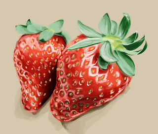
This was a really small assignment for our immunology class. We were asked to take a drawing we produced for textbook illustration and render it in Adobe illustrator using a cel shading approach. It's not great but I thought I'd post it.


 I generally avoid Photoshop but I am trying to make an effort to learn how to render/paint different textures and make them look life-like. I had trouble with the leaves... but the flesh of fruit is so easy to paint. It makes me feel skilled heh. For the first time I started without outlines (I have a very hard time drawing without clearly demarcated lines). Instead I blocked in large areas of color and built up the shadows and highlights, which is probably what most people do but I have a hard time since I work so much in Illustrator and am used to problem-solving a piece rather than building up through fluid, blending forms. Anyway, I'm happy with it. I'm going do a series of these relatively simple photoshop pieces that focus on texture, depth and color rather than likeness.